Embodying the pioneering spirit of an ambitious aviation start-up
A rapid rise in the number of China’s wealthy elite has led to an increase of high-net worth individuals seeking a simple bespoke white-glove travel service. The challenge was differentiating Amber Aviation in a competitive space, and expressing the start-up's natural evolution in a compelling and creative manner across all channels and customer touch points.
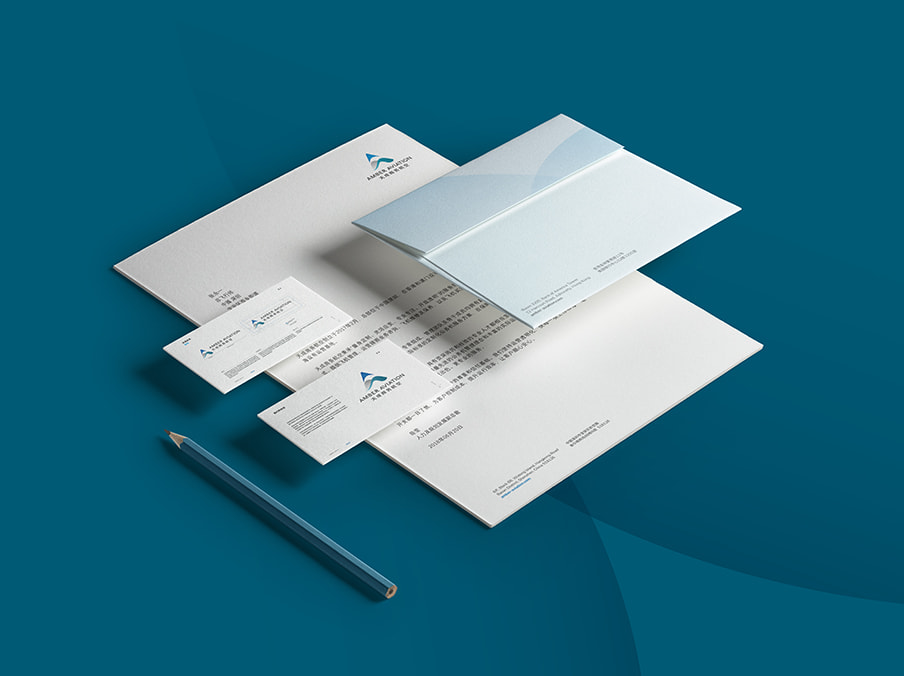
As a strategic brand partner, my team and I launched a brand that cleared Amber for a smooth take off.
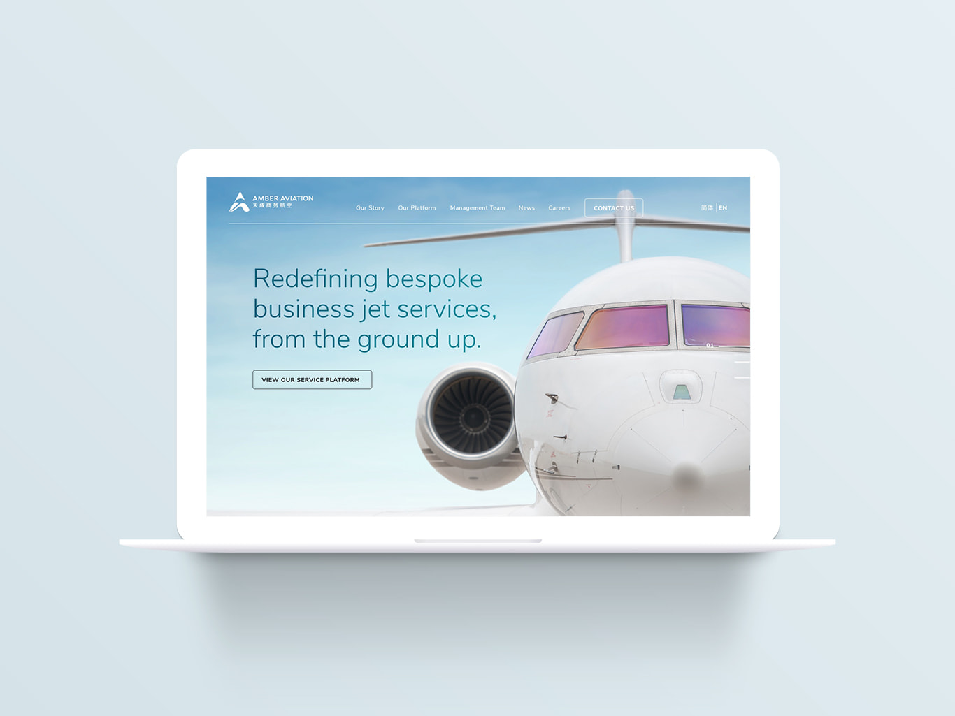
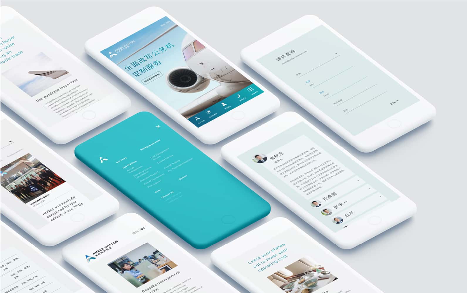
Brand Alignment
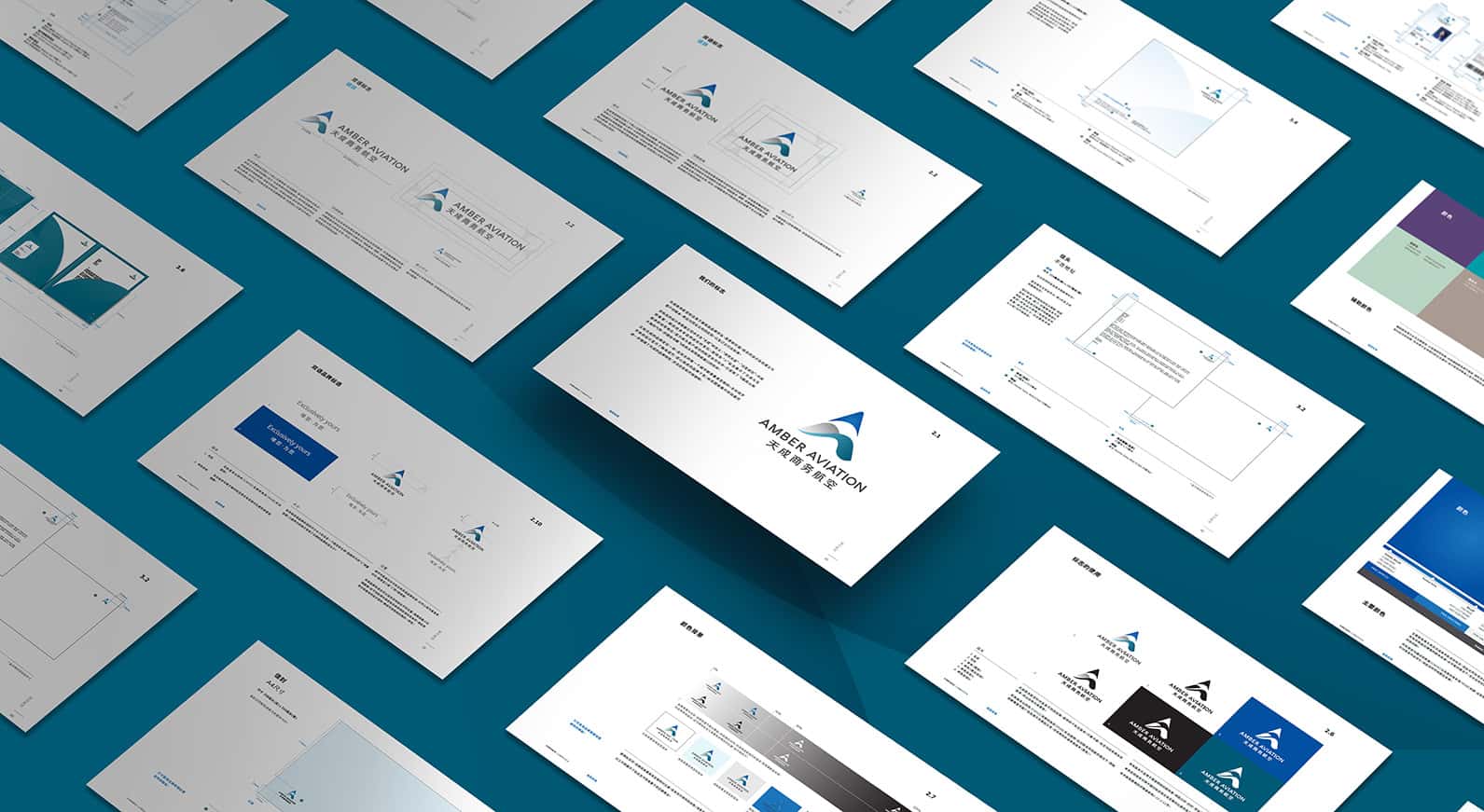
We conducted a series of exercises with key stakeholders to align on Amber’s brand expressions, personality and end user needs. The findings from our workshops acted as the foundation for our work to create a brand language and visual expression.

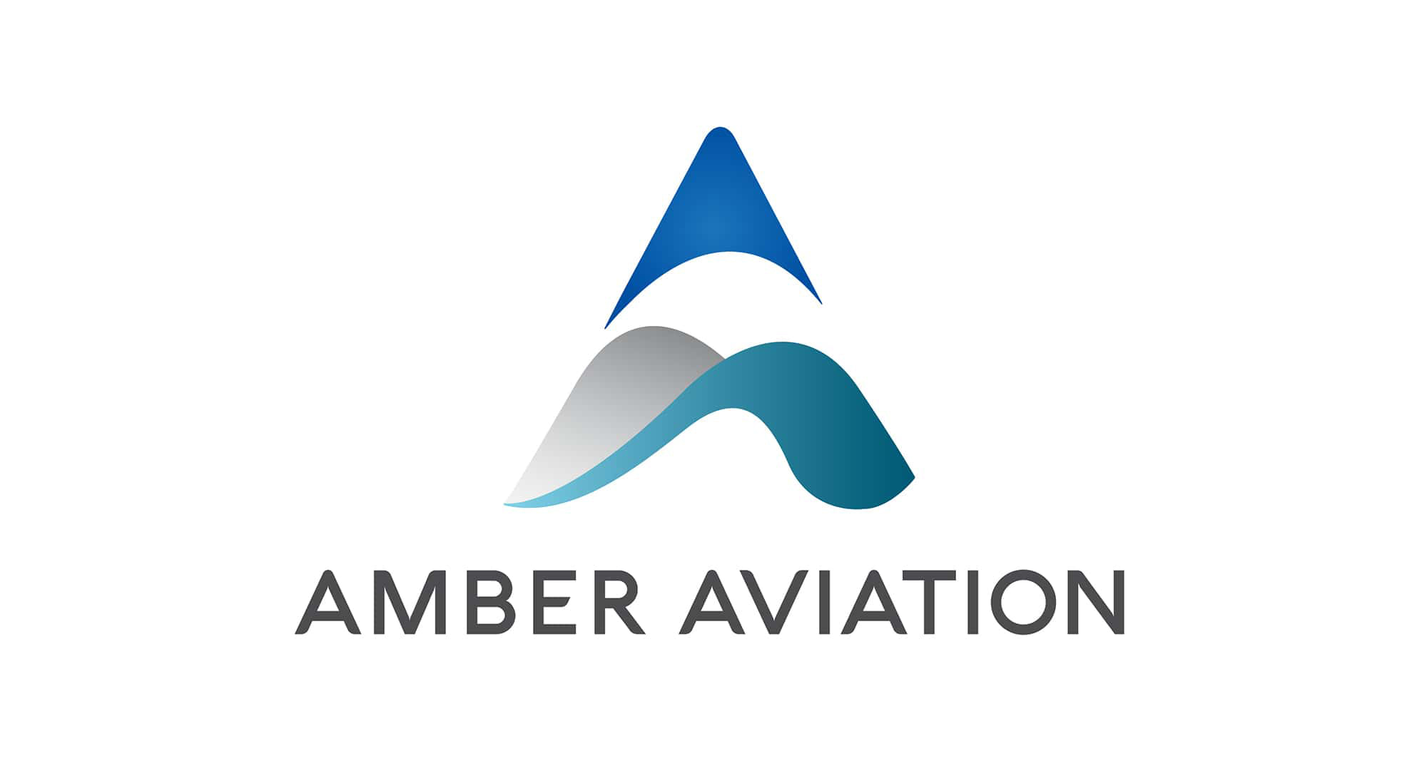
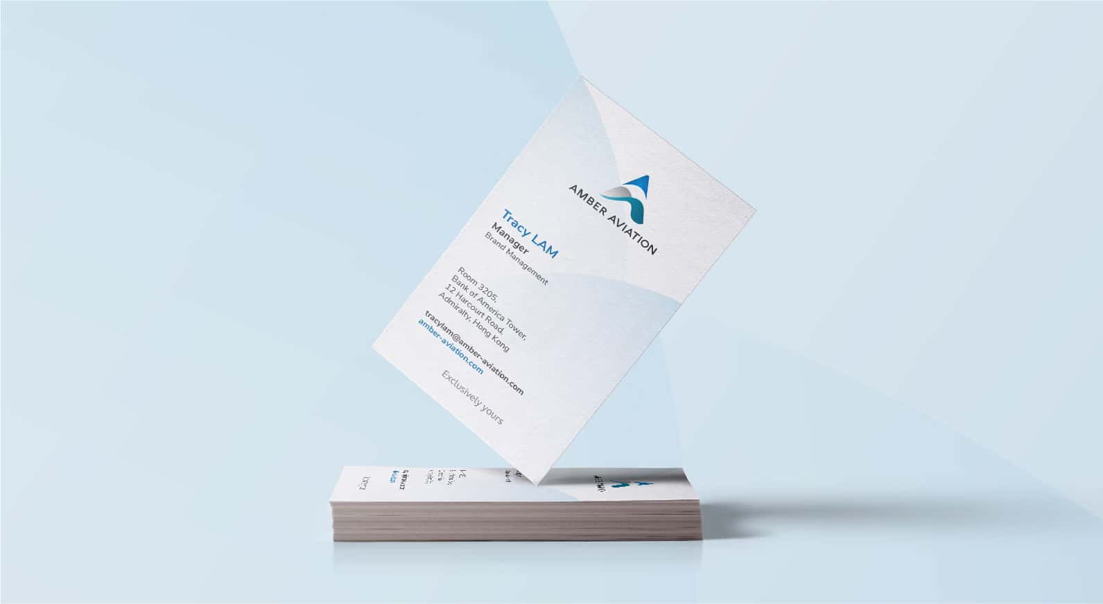
The resulting logo was bespoke in nature, communicating a sense of flying high over mountains and seas. It can also be viewed as a top view of a jet nose and cockpit window.
A high-touch website experience
One of the challenges I faced early on was to create a website that could communicate a tailored value offering based on the many different user personas. After spending time working with Amber to understand how their clients perceive the brand, I pinpointed the user types and outlined a flow demonstrating the ways users could reach their desired information on the website.
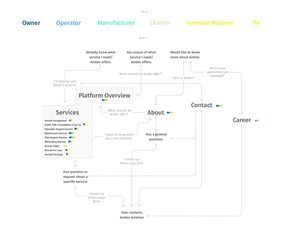
Refering to the above information mapping, I led a usability design session with the digital team to brainstorm on possible interactive patterns needed to effectively allow the users to navigate to their required information. From this quick exercise, a simple componentized graphic user interface library was born. With this list of interface components, we were able to rapidly build wireframe prototypes and test creative ideas.
Amber as a platform
Amber offers more than just charter flights. They have several additional types of aviation services like aircraft certification and even aircraft delivery. Quite often some of Amber’s clients might simultaneously require more than one service type. Therefore, my objective was to present Amber’s services as a platform that could be personalized (combined to work with each other) while simultaneously highlighting individual services for clients that only require one specific type of service offering.
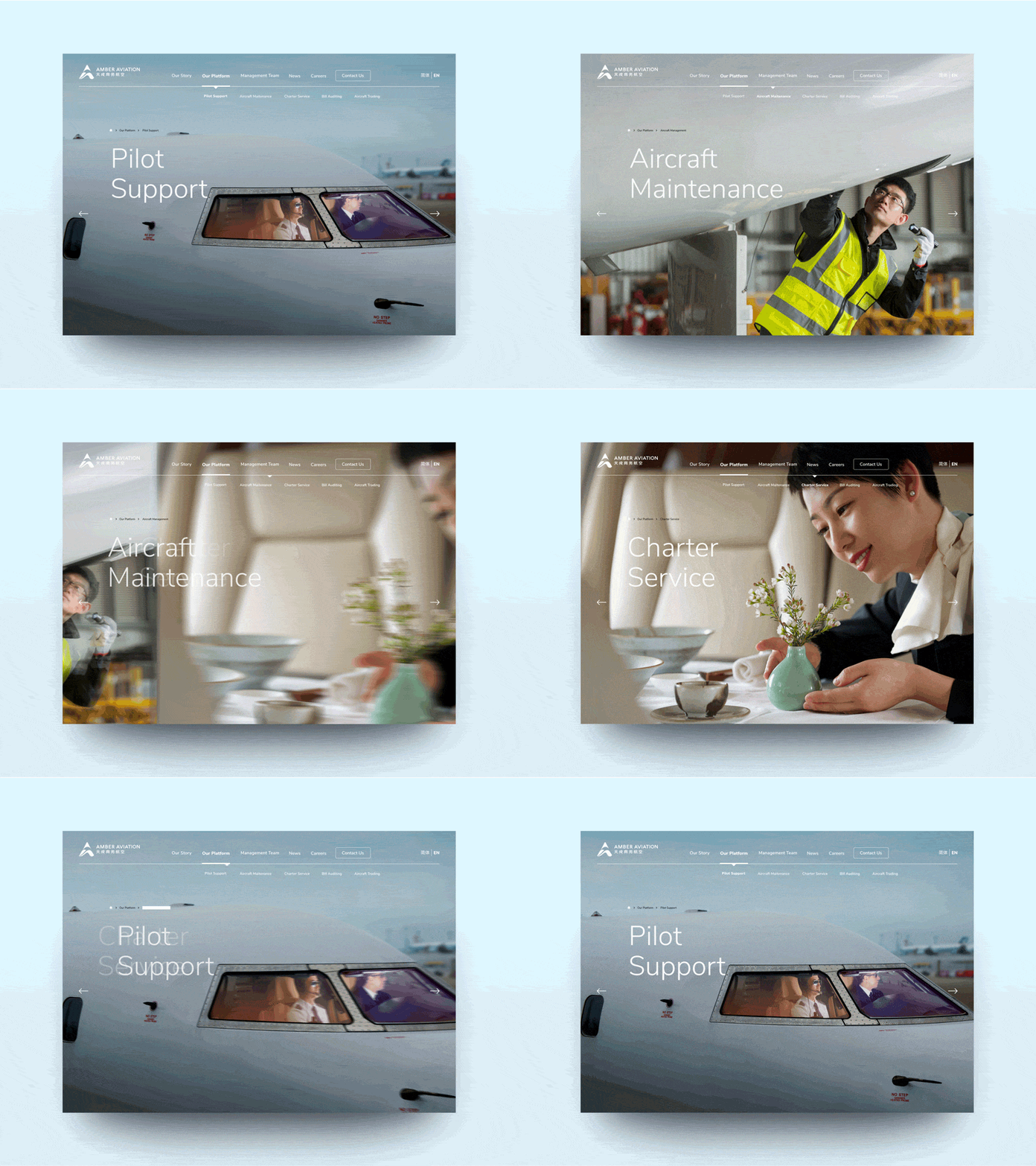
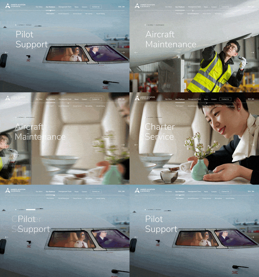
As users browse individual service offerings, I incorporated seamless transitional micro animations deliver the sense of an intrinsically connected platform.
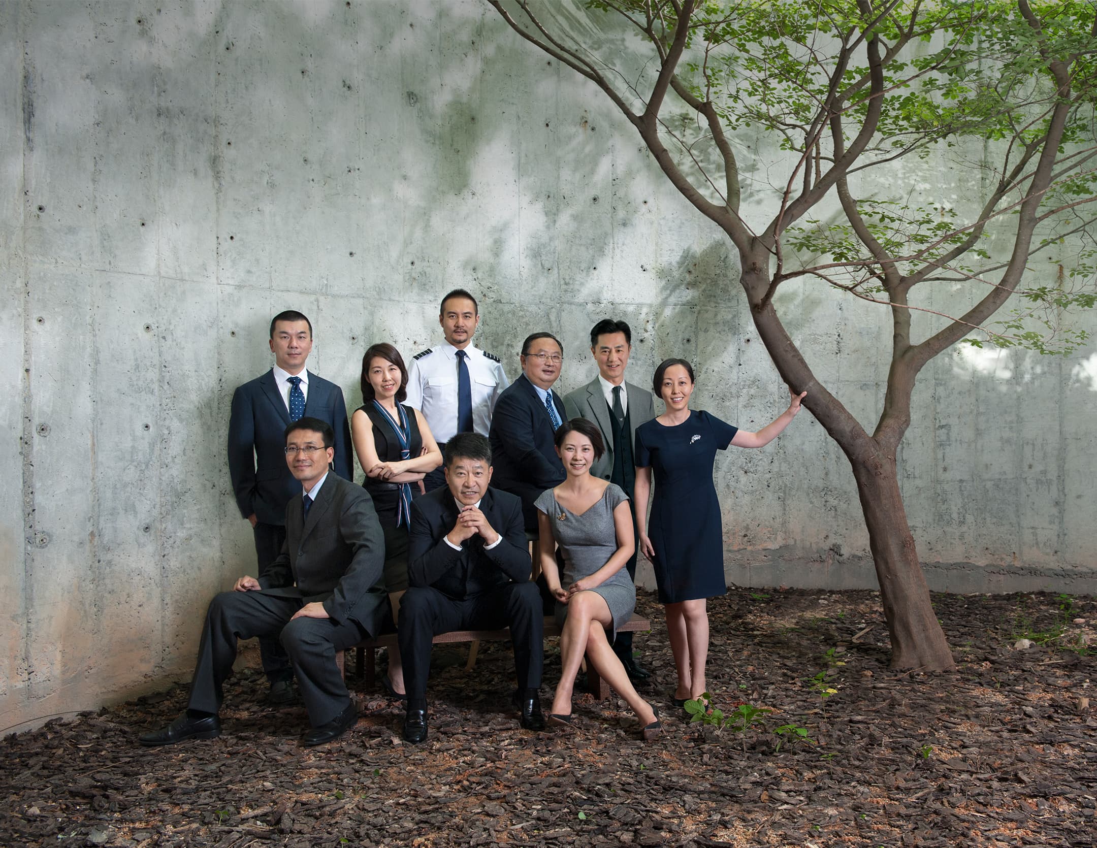
This idea of relating the value of an individual part in the context of its whole sum was also the concept behind the team page:
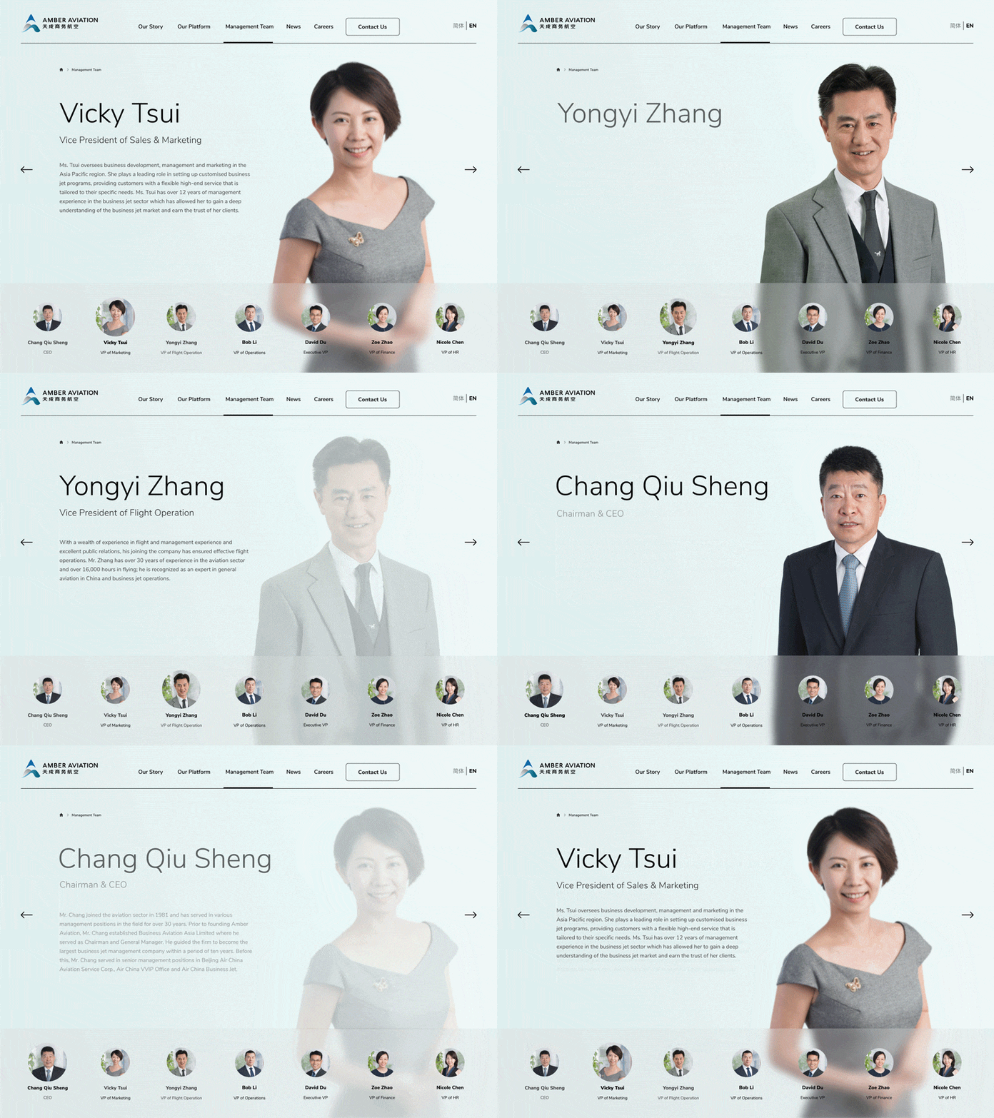
Giving the brand altitude
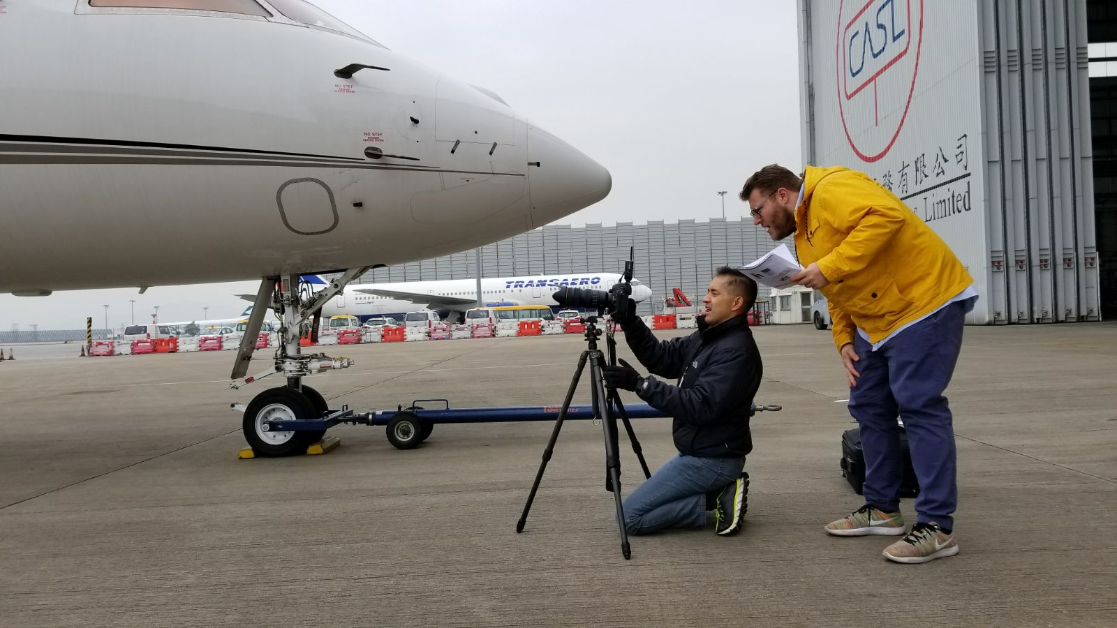
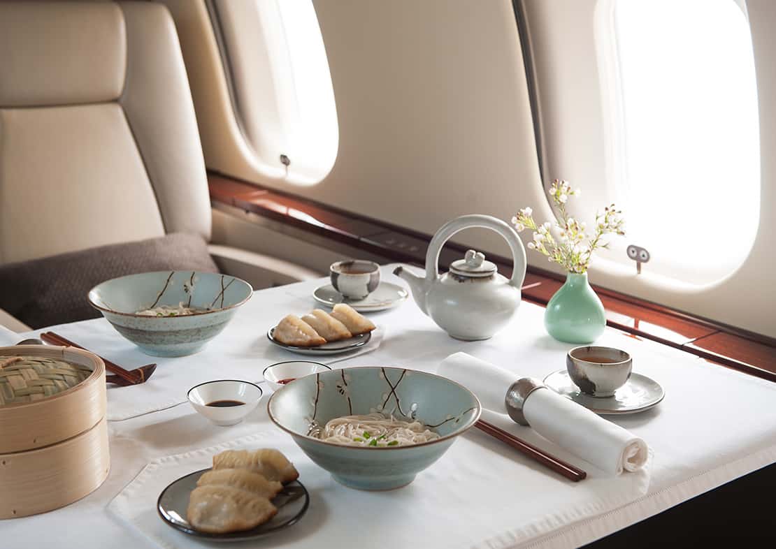
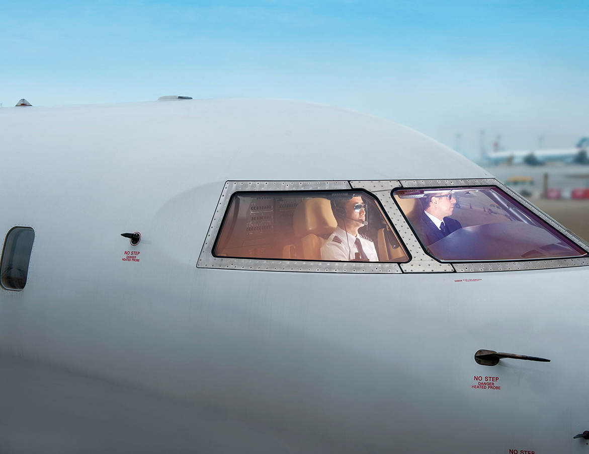
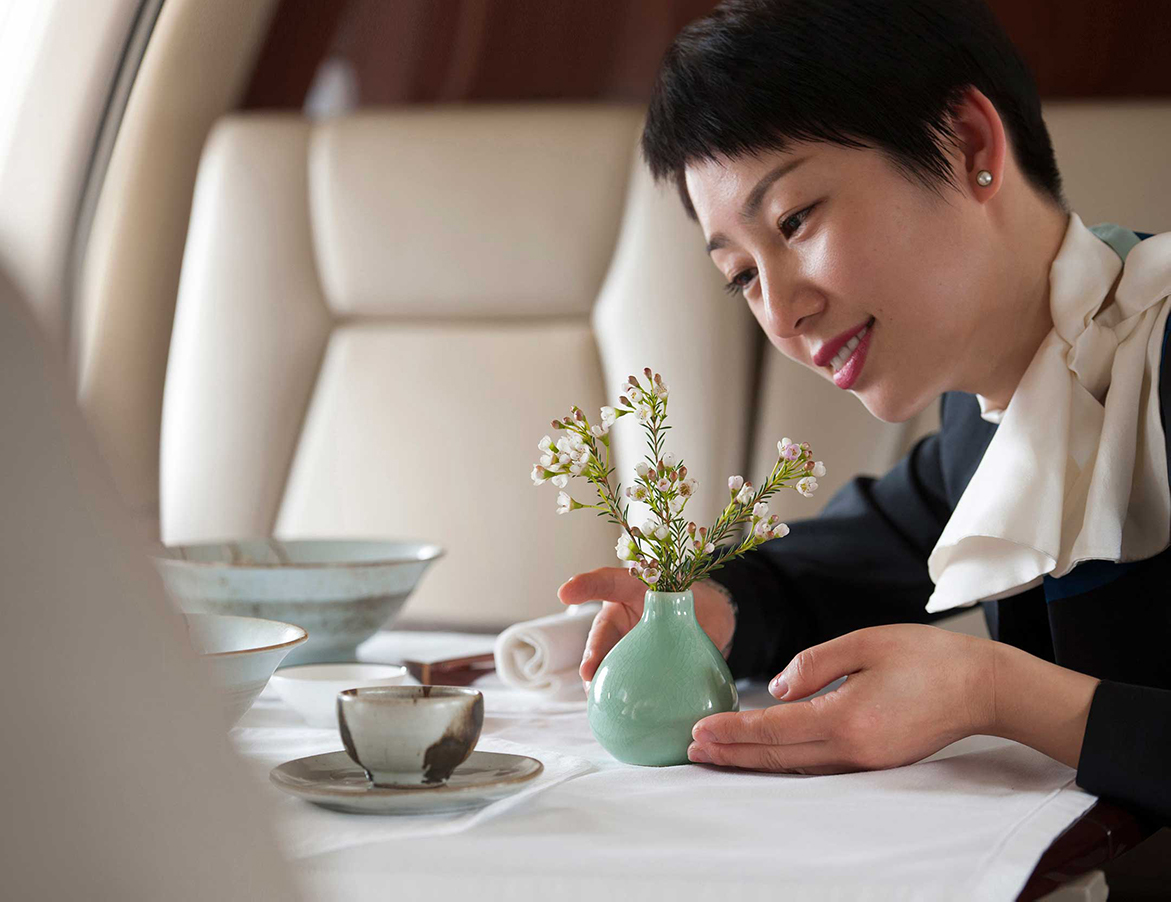
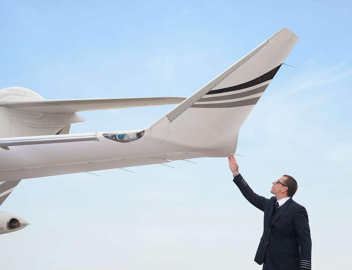
All customer touch-points reiterate and substantiate the core brand voices of approachability, experience and ease. To differentiate in a competitive space, I directed photoshoots to capture and communicate Amber’s authentic services online.
No stock photos were used anywhere in their digital footprint; all images were captured from their business-as-usual operations.
Awards
Transform Awards Asia Pacific 2018
Best visual identity from the transport and logistics sector – Bronze
Best use of a visual property – Highly Commended
Best strategic creative development of a new brand – Highly Commended
Role
Design Lead
Sector
Aviation & aircraft services, start-up
Partner Agency
Sedgwick Richardson
Hong Kong
Other work
Asia MilesLoyalty & frequent-flyer program
HuaweiCorporate website

DidoniPersonal typeface

Suzy QProject type
AmberAviation & Aircraft Services, Start-up

LamexE-commerce

FullscriptE-commerce

Odds & endsArchived works
What can I do for you?
View me on:
© Chris Plosaj 2023