Case study: A redesign process
Redesigns are profound. As a ship date approaches, the team can get caught in a turmoil of emotion. After months of work, we ask ourselves, “Is it ready? Is it ever really ready? How will users react? Will they love it or hate it?” We feel fear and uncertainty, but also optimism as we reach the top of the first hill.
First, let me introduce the company: Fullscript (formerly tech-savvy startup Healthwave) enables practitioners to “dispense” products from the cloud, without the cost and hassle of stocking physical inventory. Practitioners are able to run their own online dispensary through their own self-branded digital storefront.
As a design consultant for Fullscript, I was responsible for the creative development and marketing of their refreshed brand as well as launching their new website.

Full - encompassing everything needed to be successful in good health
Script - a prescription, and a nod to the technology aspect (code) of the company
Design with intent
When I have an idea for a feature or design, I spend time discussing and thinking about its implementation and usage. I seek to arrive at a general understanding of functionality and purpose, and then convert abstract ideas into more concrete solutions. Usually this involves a lot of brainstorming with various teams, HCD workshops, UX research and a lot of Post it Notes. (side note: Post it should really pitch themselves as the global ambassador of Design Thinking)

Design for people
This is an important thing to remember: There are the possibilities of technology and requirements for business success, but ultimately taking a human-centered approach to innovating by integrating the needs of people will lead to benefits that go way beyond just increasing company profits.
By leading with competitive research, taking a look at the existing data analytics and conducting key stakeholder interviews, I was able to frame the context and highlight insights that made it possible to design in a way that tackled systemic challenges. My top 3 insights were:
- Shortfalls in website conversion
- Fragmented cross channel brand experience
- Frustrating website user experience
This is how I approached and solved each of the above challenges:
1. Leveraged interaction fundamentals to boost conversion
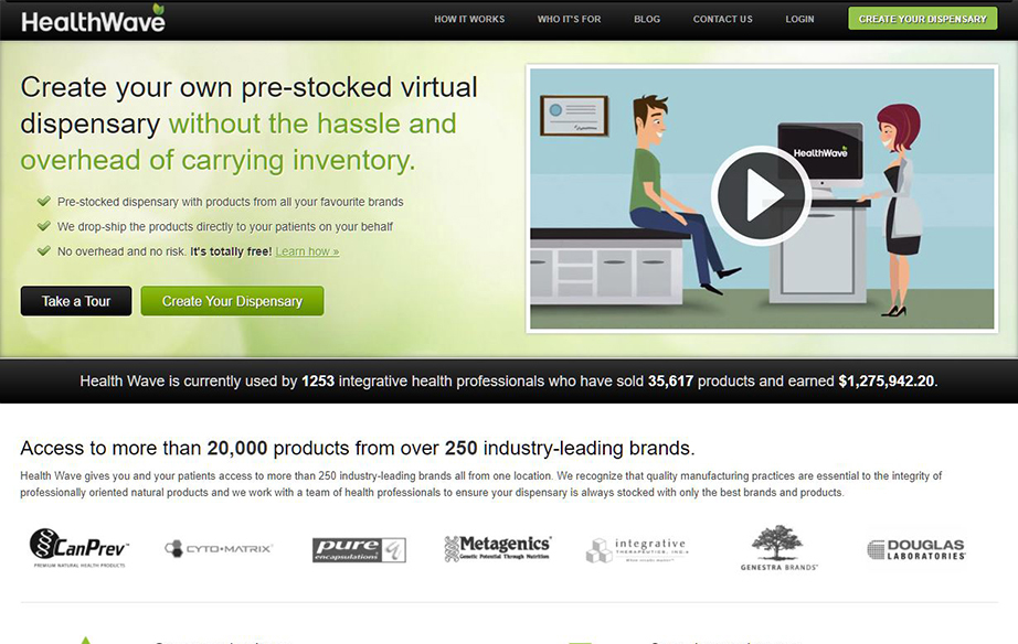
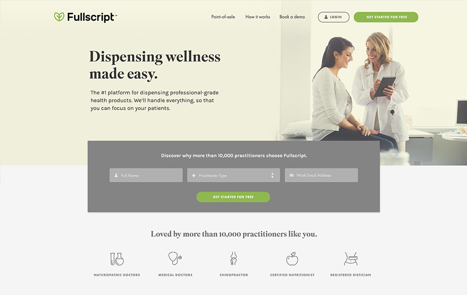
The time it takes for an individual to make a decision is directly proportionate to the amount of choices and information they are faced with. I successfully improved conversion by streamlining the user choices and reducing decision anxiety. This approach included minimizing the distractions on the landing page, maintaining a clearly articulated value proposition and implementing a rapid sign up method directly on the landing page. Plus, Fullscript was able to rapidly capture leads directly from this form.
Use the slider below to compare the landing page before & after:
2. Use targeted web journeys to deliver relevant information
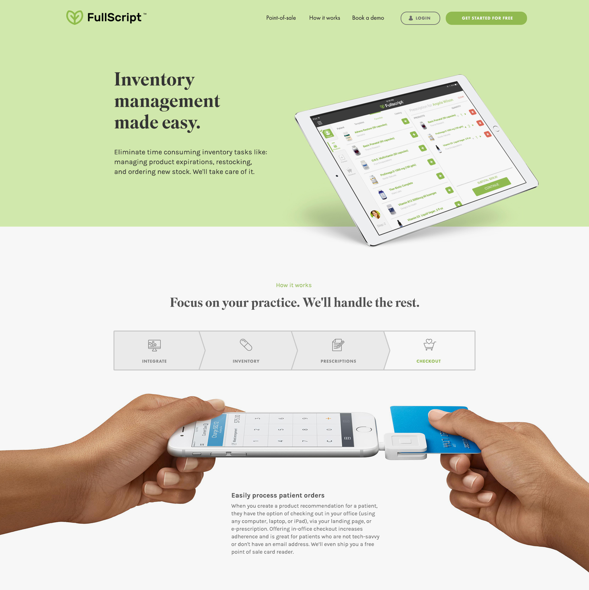
One of the challenges was handling content targeted to the different types of users: experienced practitioners, new practitioners, practitioners seeking to source inventory digitally, and practitioners with existing physical inventory. Using visitor segmentation, we were able to funnel users from relevant marketing channels directly to the specific section or microsite that was most useful for them.
3. Analyze & iterate
We listened to our users and built a greatly improved website. However, the design didn’t just end there. Building the website on a CMS platform allowed us to continue tracking how users engaged with the content. I split tested different layouts and monitored minor ongoing website design adjustments, tweaking slightly each round according to the resulting user data. This ensured that the overall website user experience was positive and helped to further optimize the conversion rate.
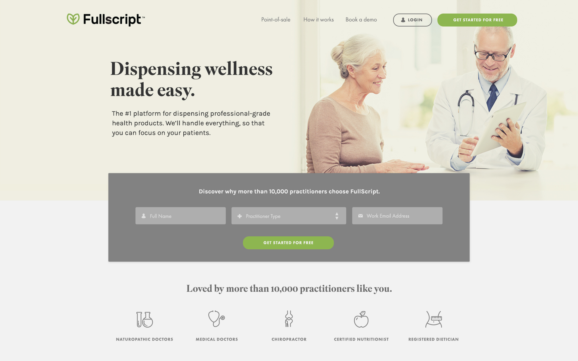
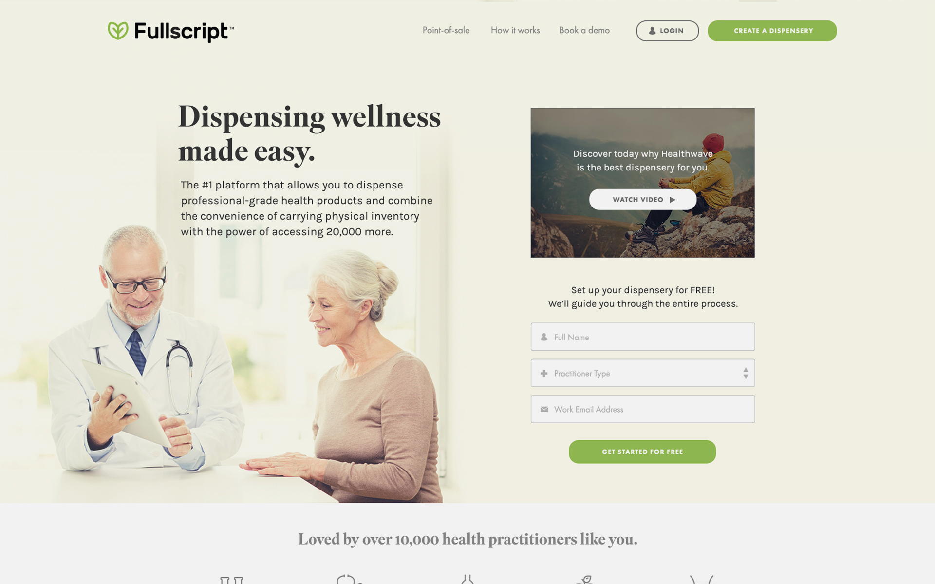
So, were the results successful? Did all this lead to any real impact to the overall user satisfaction and engagement? The impact was huge. Within 6 months the website conversion had substantially improved, leading to quadruple-digit growth.
"
Fullscript has landed in top spot on OBJ’s list of fastest-growing companies for the second year in a row. The company’s latest three-year growth rate clocks in at an eye-popping 3,128.6% – more than double its already impressive mark of 1,245% from 12 months ago.
Role
Interaction Design
Business Analysis
Brand & Marketing Consultant
Sector
E-commerce, health & wellness start-up
Partner Agency
Freelance consultant
Other work

Asia MilesLoyalty & frequent-flyer program
HuaweiCorporate website

DidoniPersonal typeface

Suzy QProject type

AmberAviation & Aircraft Services, Start-up

LamexE-commerce

FullscriptE-commerce

Odds & endsArchived works
What can I do for you?
View me on:
© Chris Plosaj 2023