Design principles



Anatomizing connectivity
Huawei has a unified landscape that encompasses IT, data managment and consumer electronics. A layered architecture creates modular, connected interface that represents Huawei’s vision of ubiquitous connectivity between their products and services.
User centric
In addition to SME interviews and a full HCD approach, there are several design considerations: A large scale consistent typographic system with multi-language support, built highly responsive for mobile devices, and a calculated utilization of micro interactions contribute to a delightful experience.
Content optimized
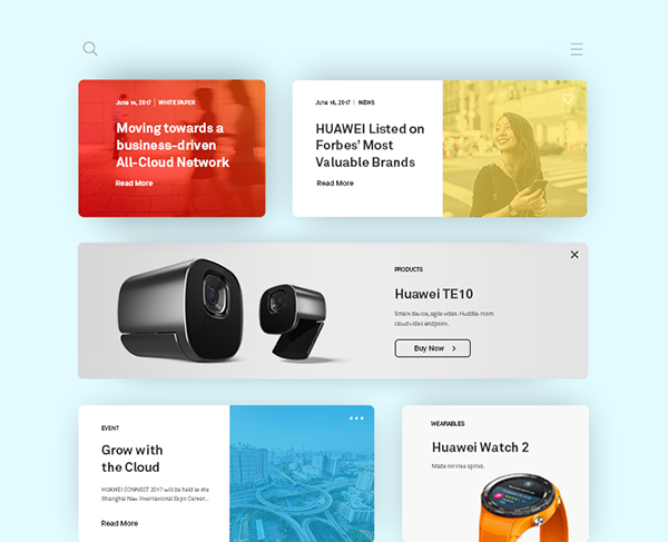
Huawei has a massive and complex digital presence. Sitecore was used to build a library of reusable interaction elements to simplify the management of rapidly evolving content. These scalable modules and templates enable Huawei to create new pages and adjust content on the fly.
Design exploration
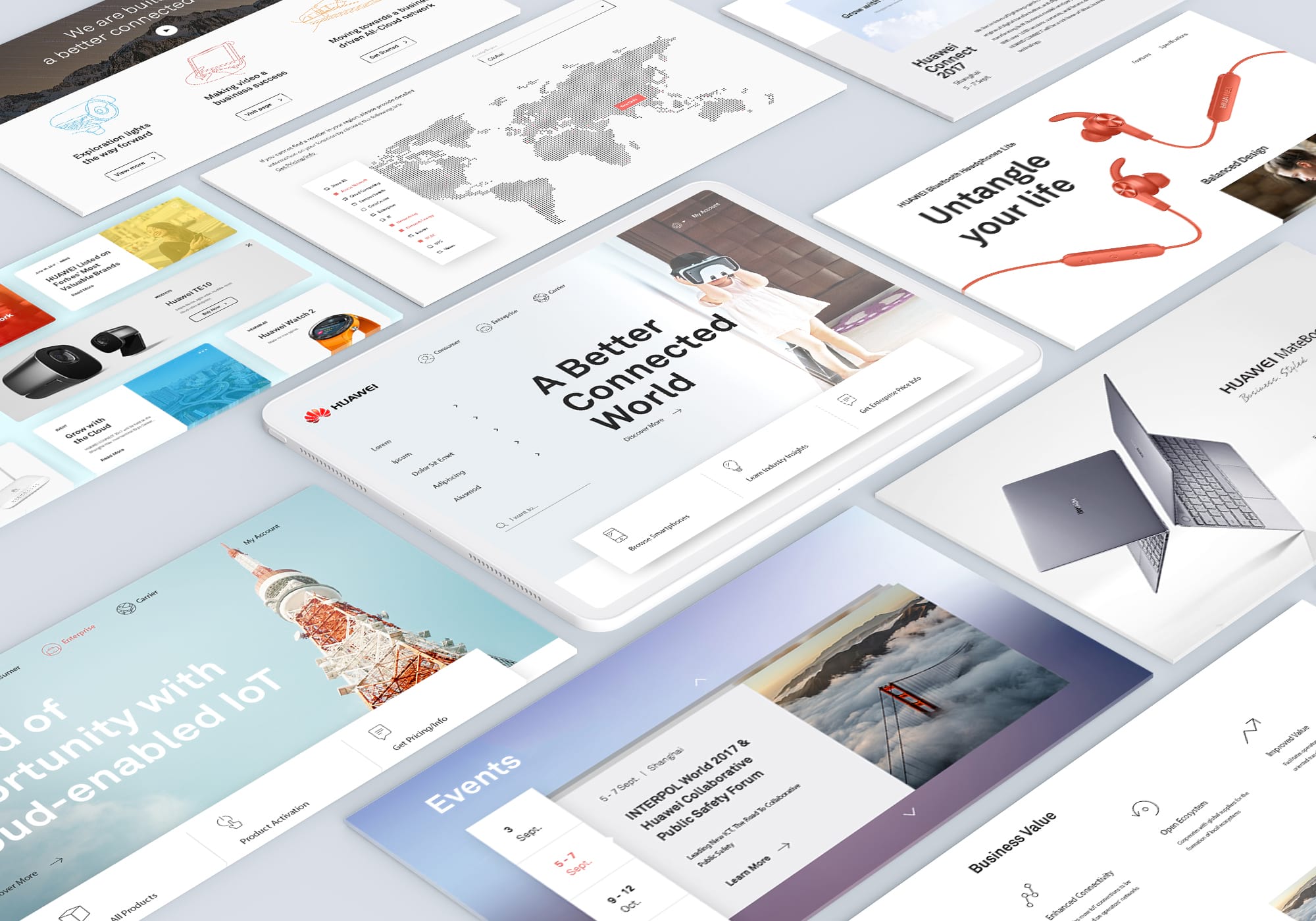
Here are the initial design explorations I did to set the art direction.
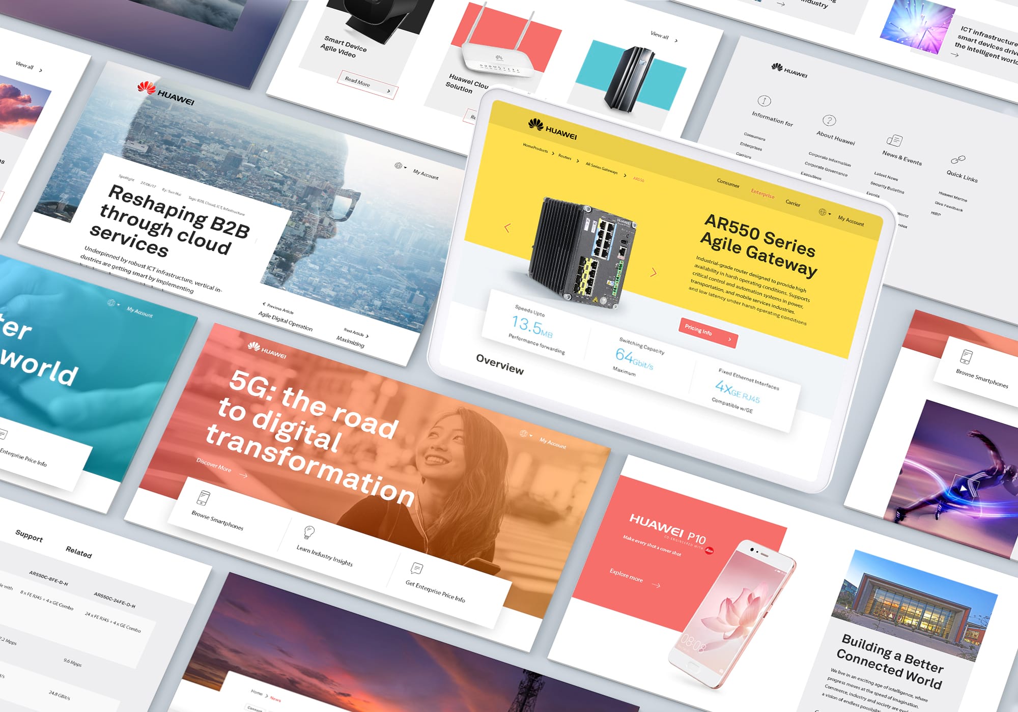
Final art direction
The final UI: a library of modular components and templates that Huawei can use to scale thier digital landscape.
Role
Art direction
Sector
Technology, telecommunications, consumer electronics
Partner Agency
Heathwallace
Hong Kong
Other work
Asia MilesLoyalty & frequent-flyer program
HuaweiCorporate website

DidoniPersonal typeface

Suzy QProject type

AmberAviation & Aircraft Services, Start-up

LamexE-commerce

FullscriptE-commerce

Odds & endsArchived works
What can I do for you?
View me on:
© Chris Plosaj 2023