Reworking workspaces
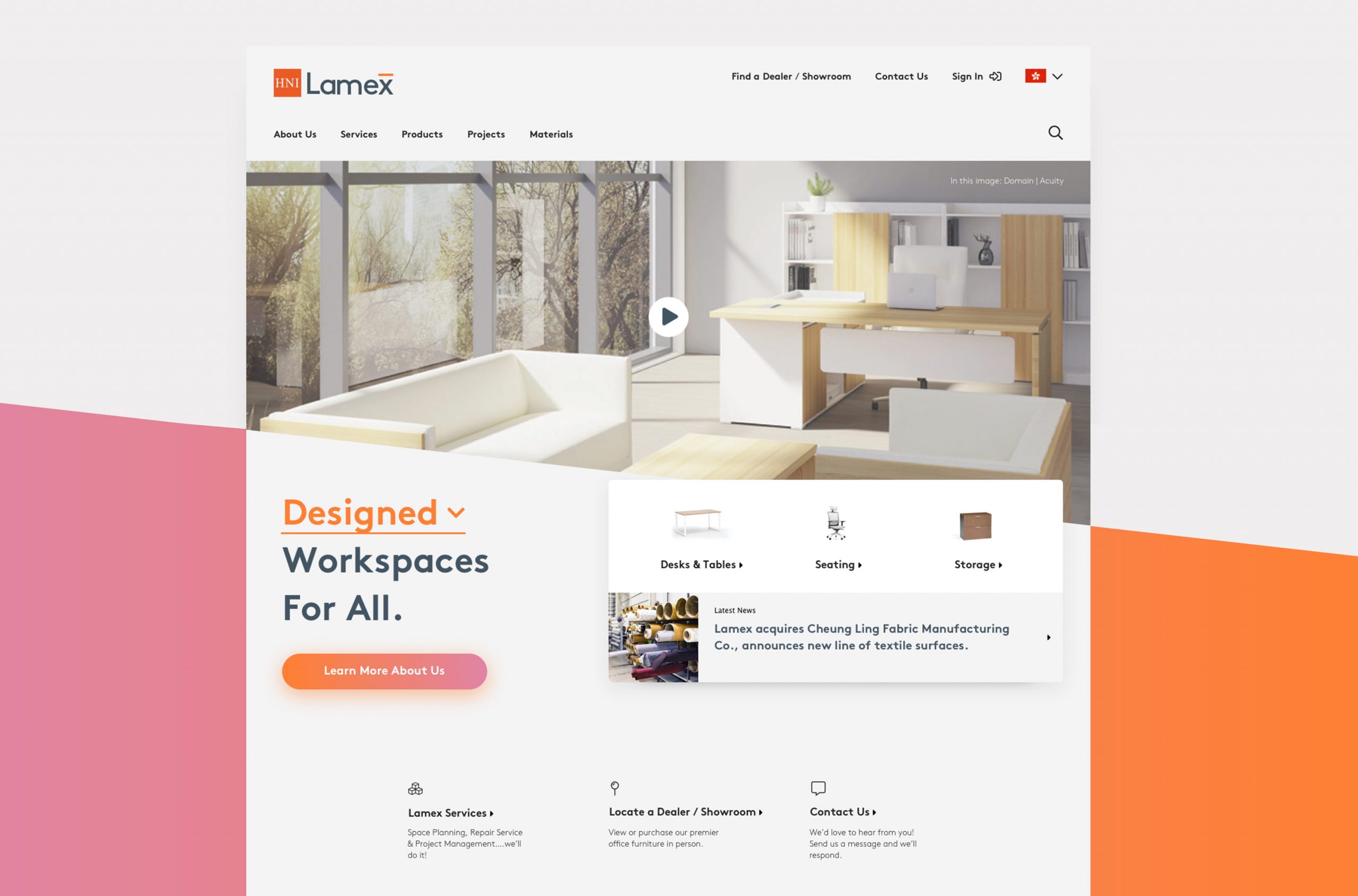
As a part of HNI, the second largest furniture manufacturer in the world, Lamex has the capabilities and energy to deliver exceptional workspace solutions. Leading with a need to better understand their target users, I helped Lamex create and launch a new website that reflected their brand, products and services.
The users
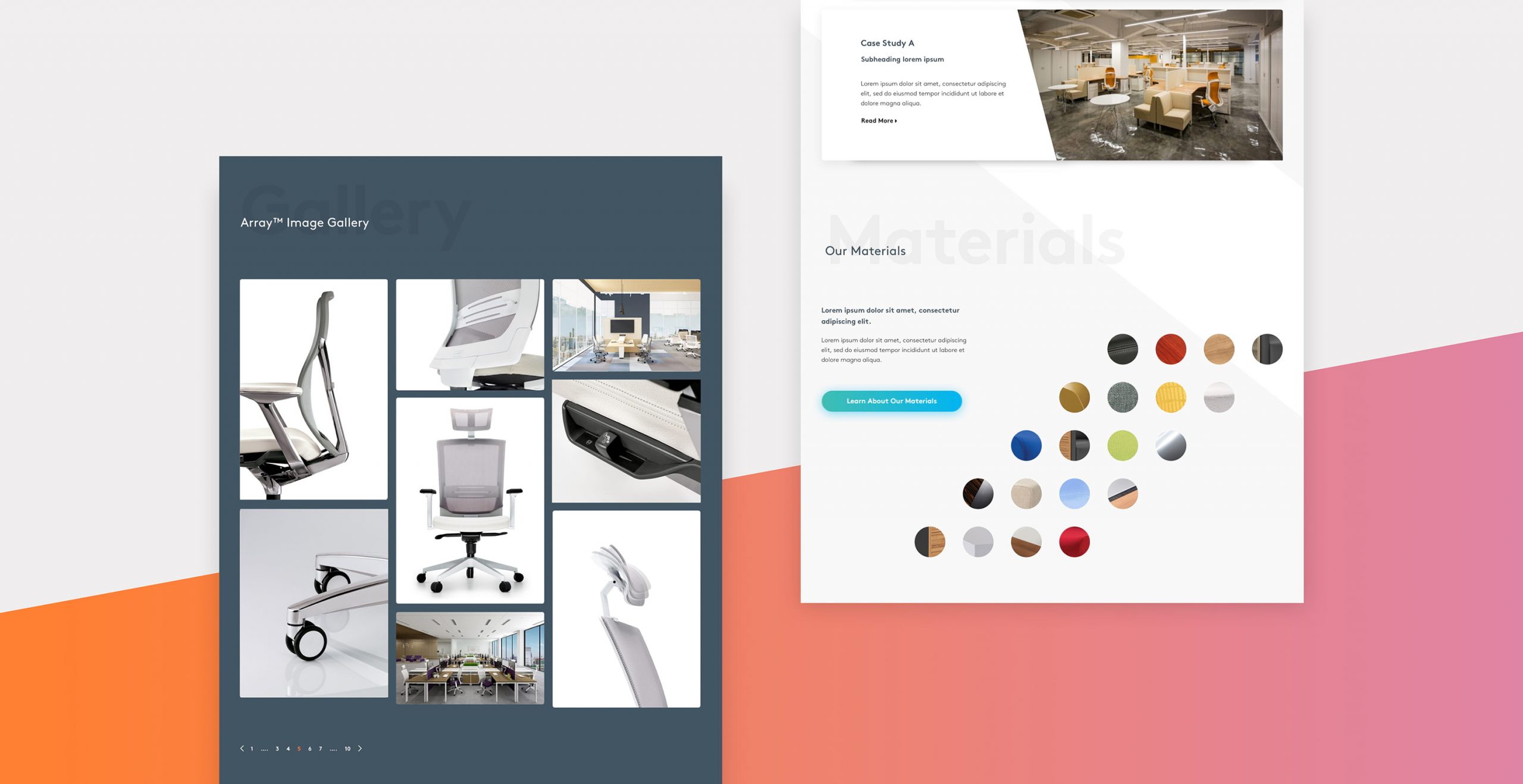
Leading with rigorous research, I discovered that Lamex's primary website users were Interior Designers. These users primarily wanted to source high resolution workspace images to include in their design presentations, and to access product related information such as material options and compatibility. A compelling and clear presentation enabled our users to easily access a wide range of relevant and engaging content.
The design approach
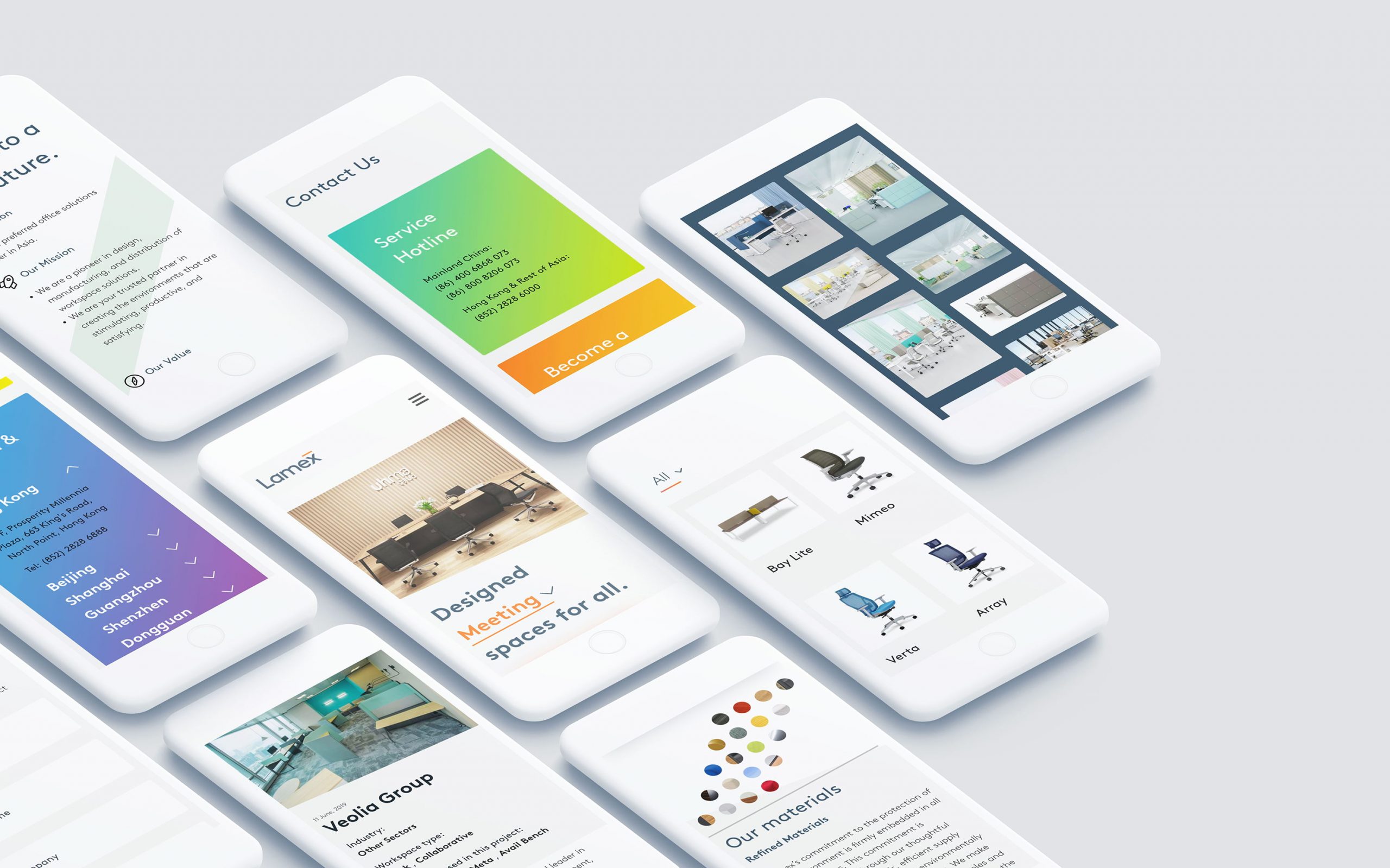
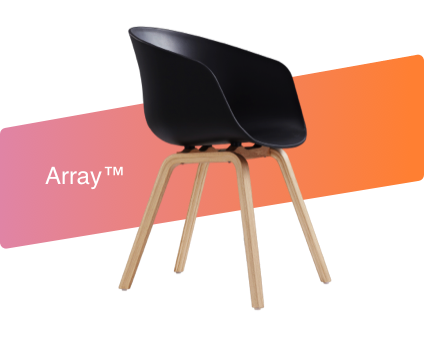
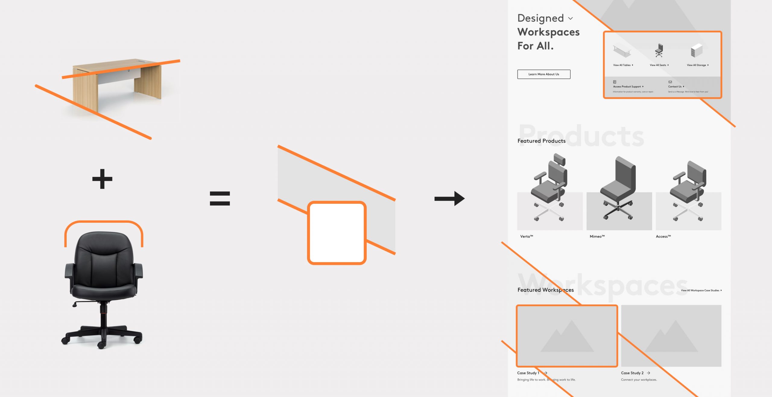
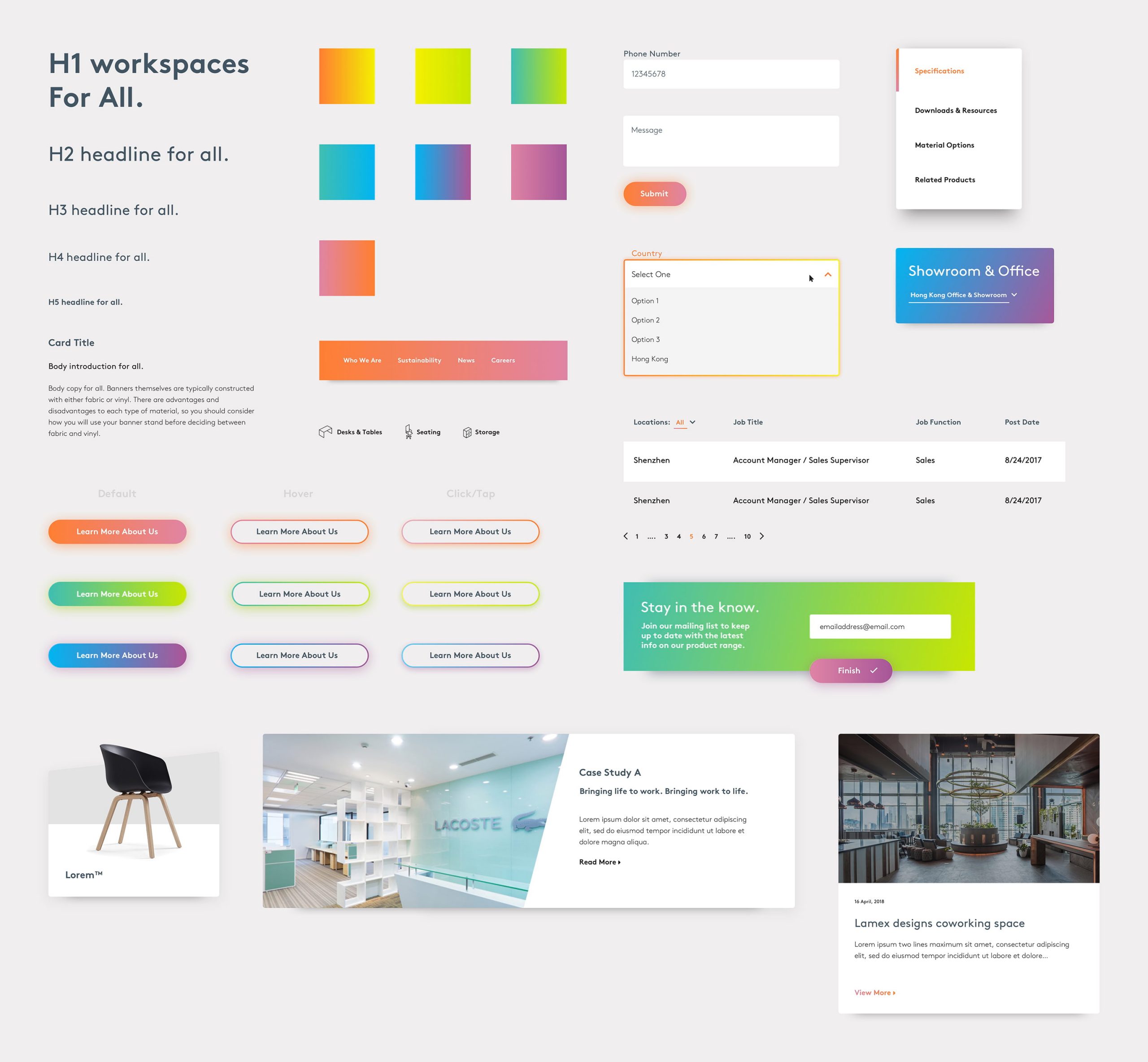
The overall design approach was inspired by distinctive Lamex product design features such as their rounded corners, particular angles and the combined perspectives of a workspace composition. Additional depth was created through a layered typographic design approach. The colour palette was inspired by the vast array of product swatches and represents Lamex’s contemporary, lively brand personality.
The Landing page
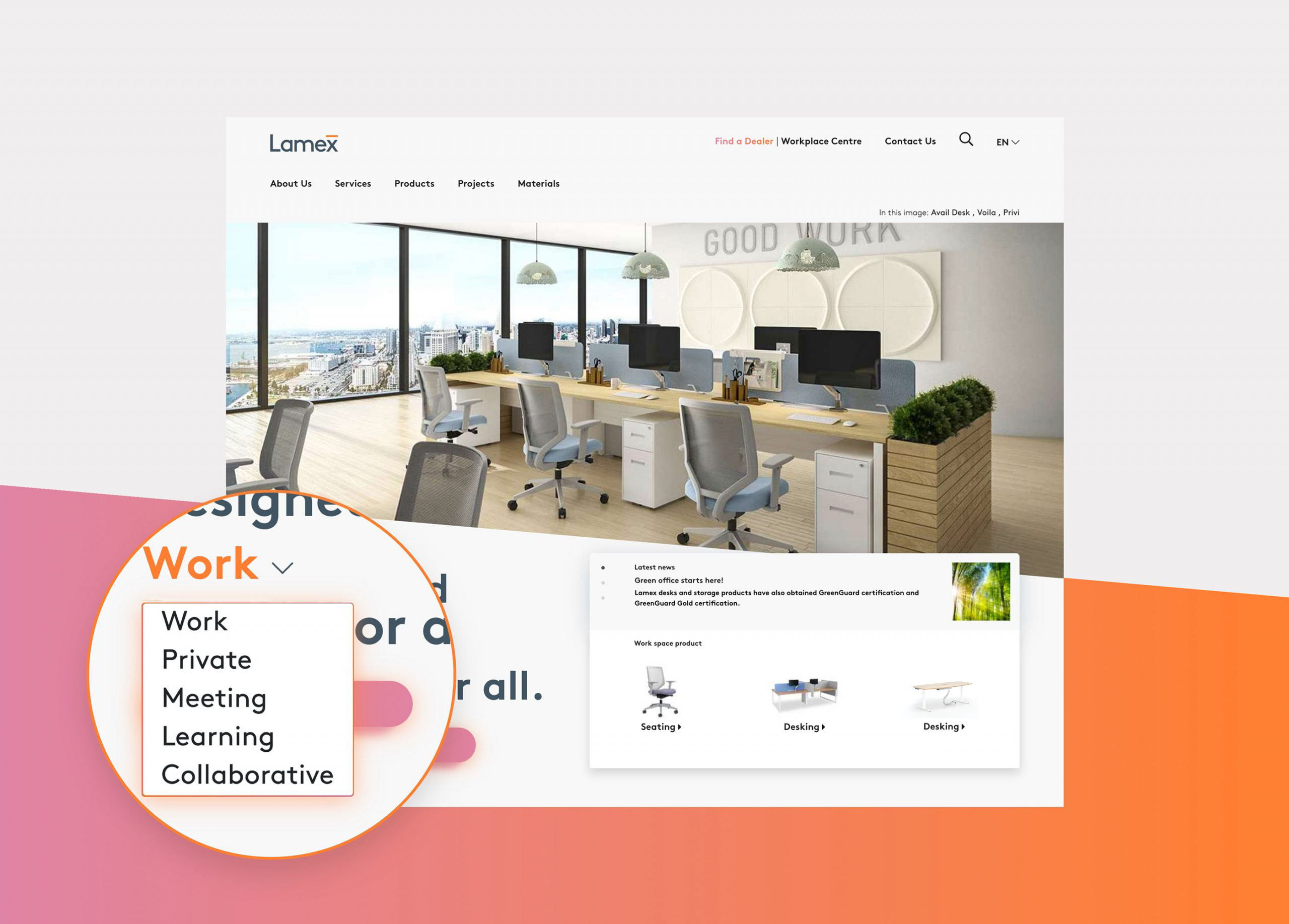
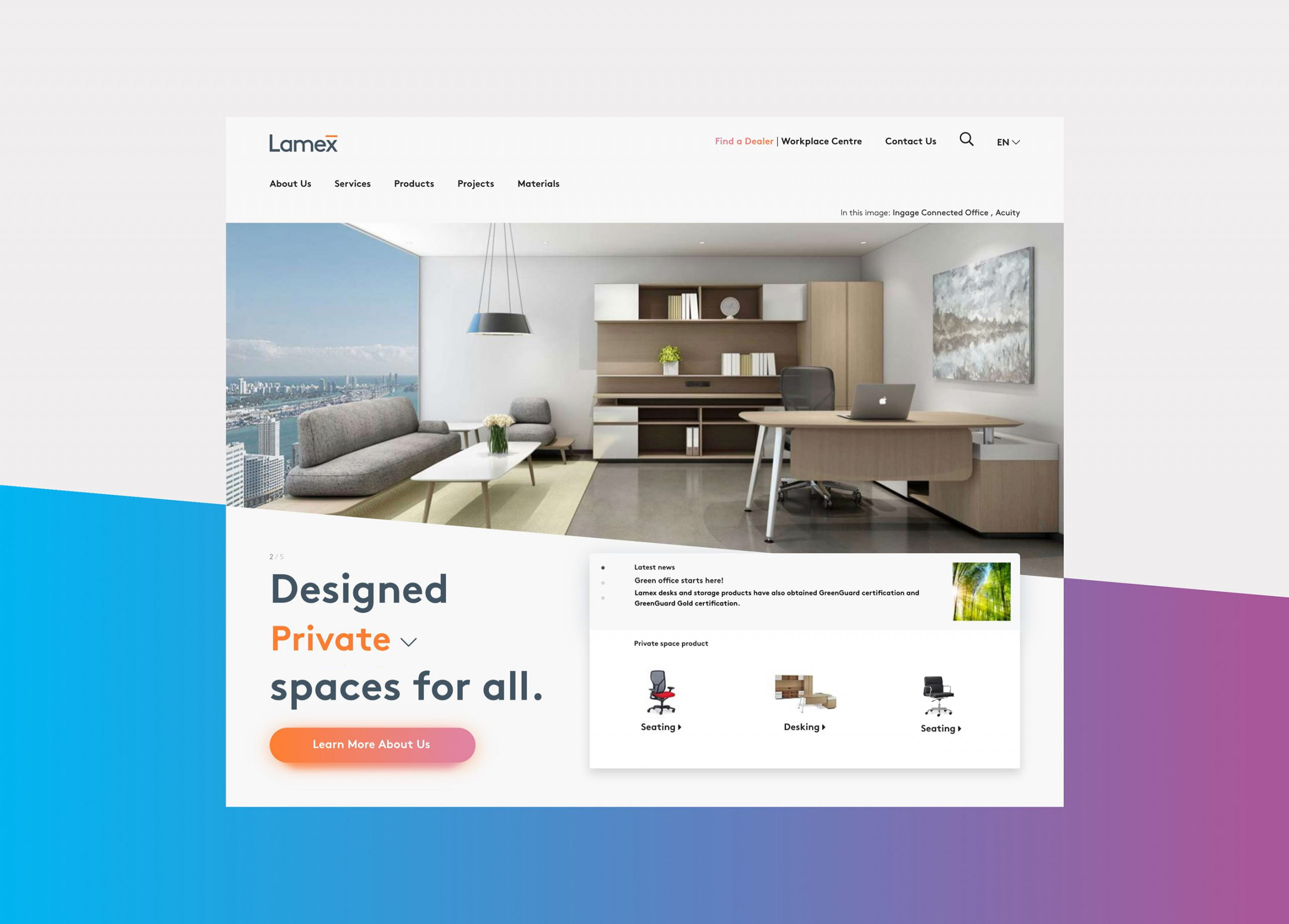
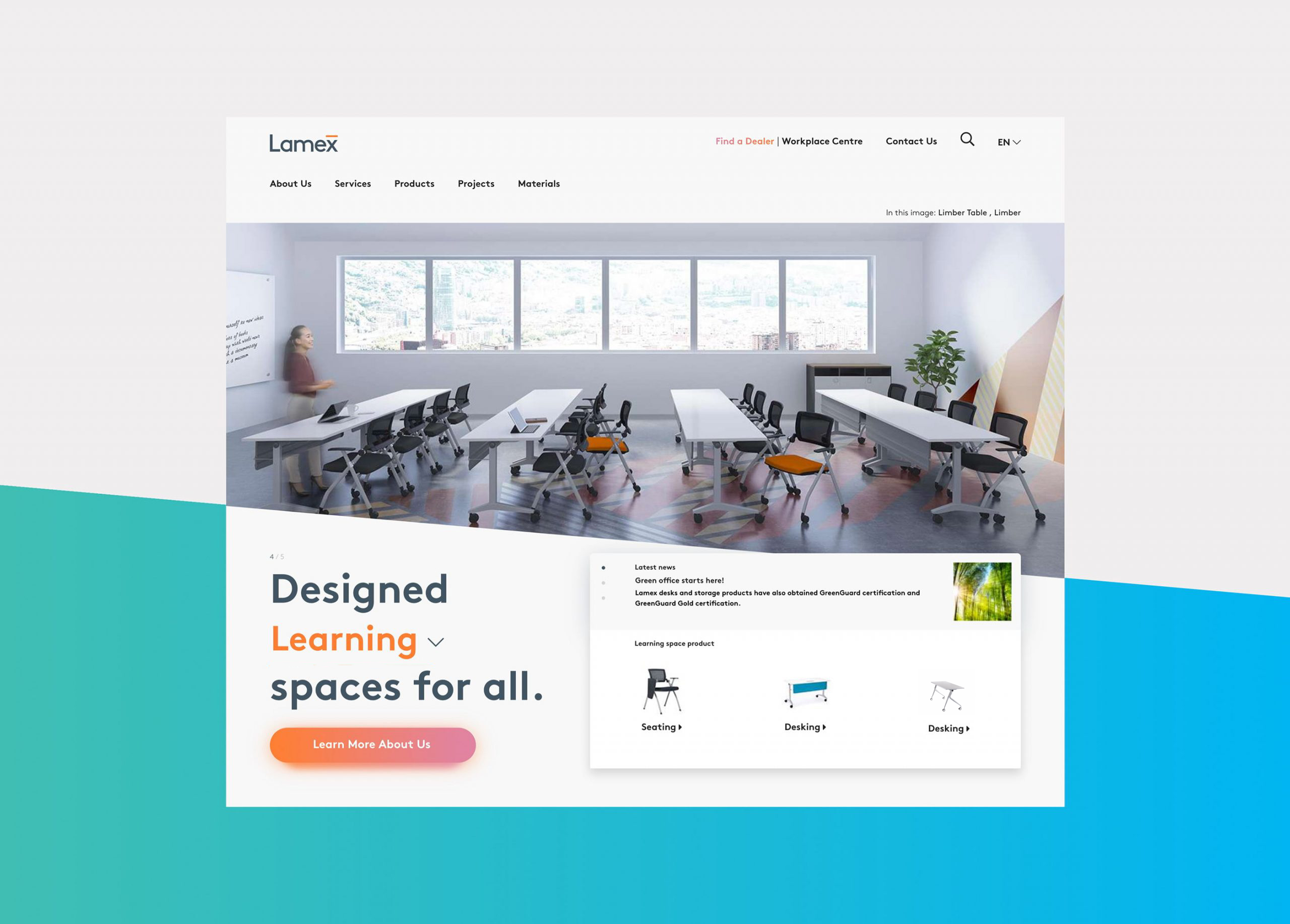
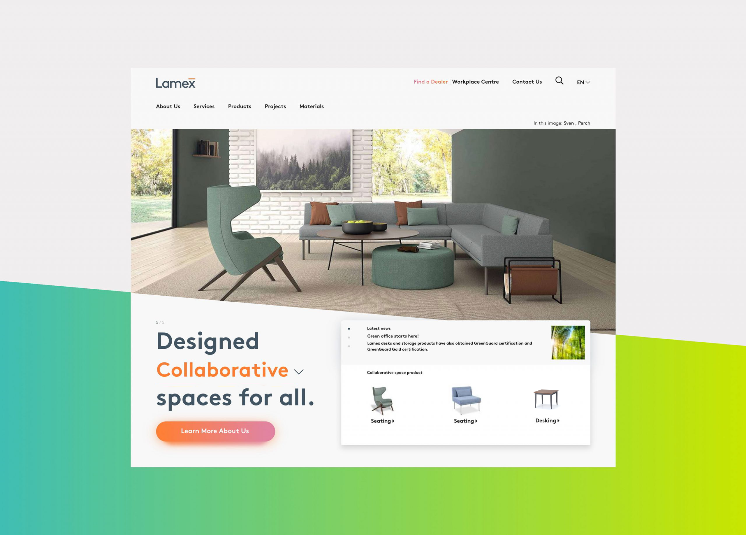
The new homepage was designed to be both functional and engaging. Based on the purposes of a space (work, private, learning or collaborative), it allows users to understand inspiring environments while simultaneously featuring individually relevant Lamex products.
Searching & filtering
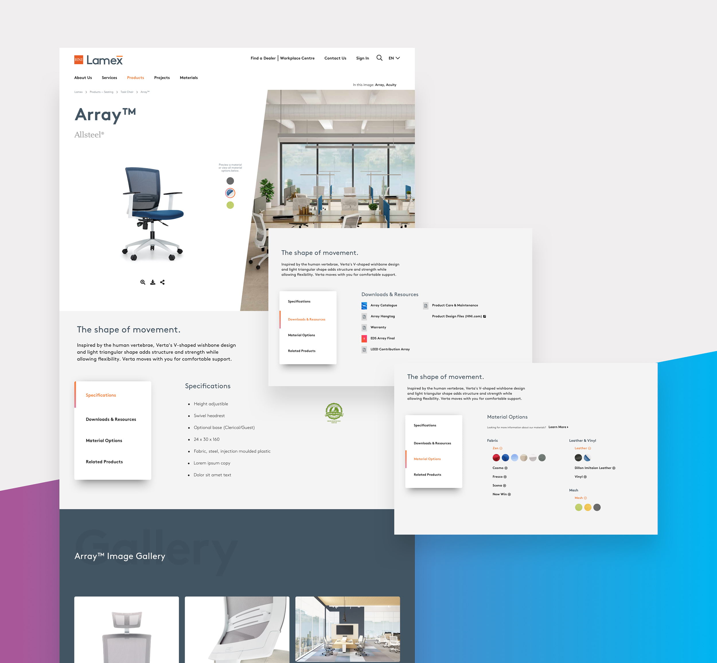
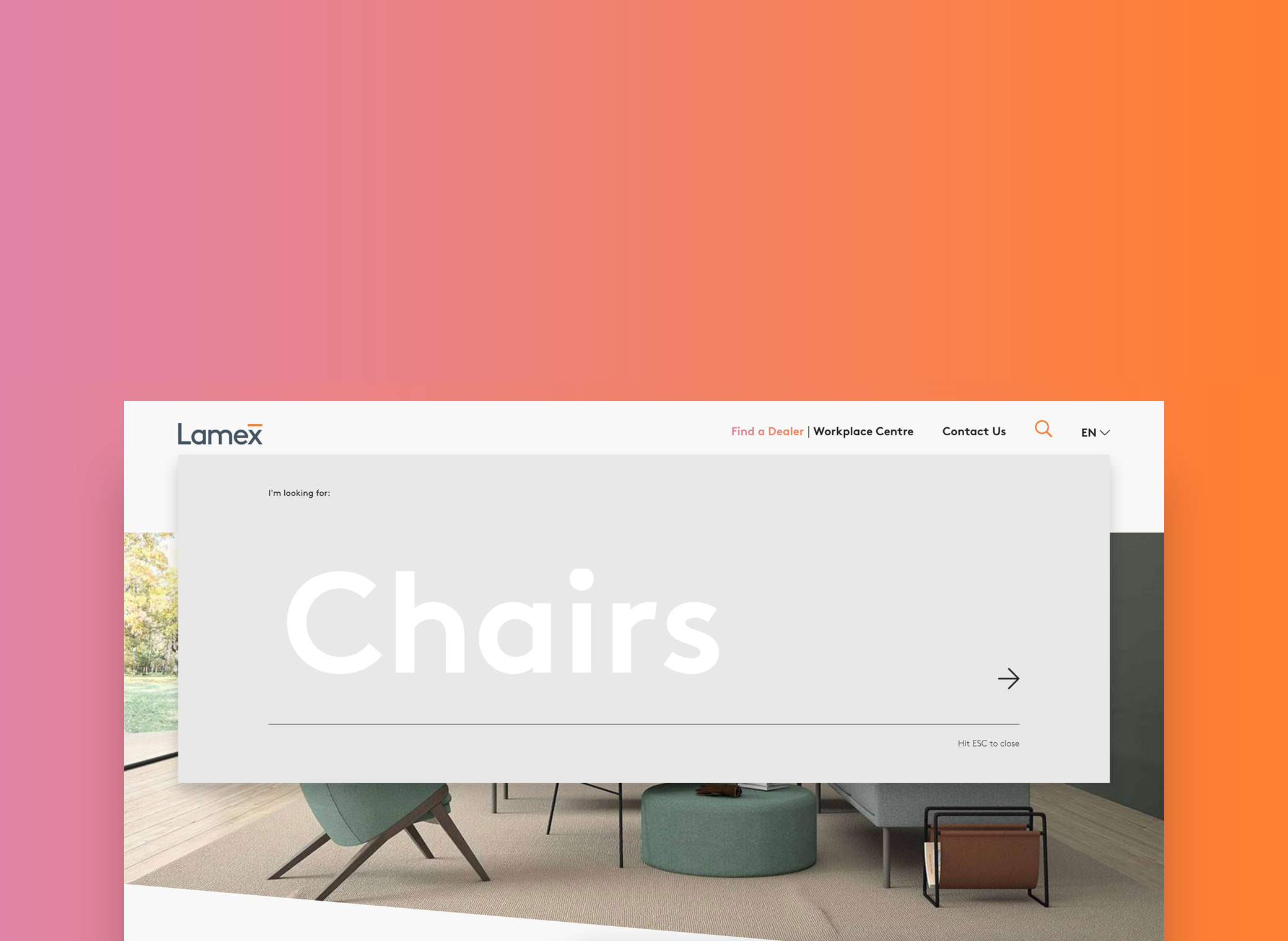
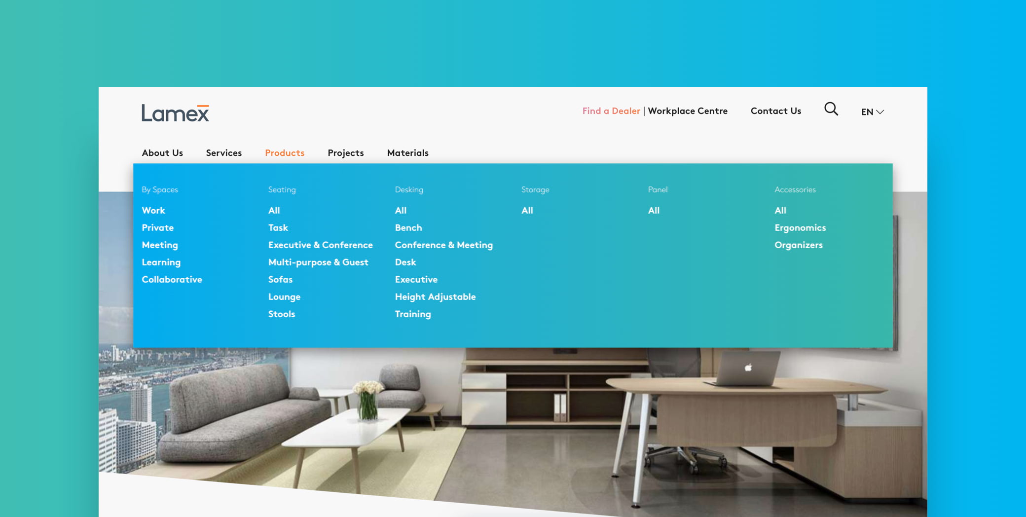
Lamex products have many configurations and varying physical specifications. The challenge was to design a clear and logical product filtering system that makes the experience of product search easy and intuitive. This meant considering the products from the viewpoint of the customer, using words they would use to describe a product, and defining higher-level groups of thematic attributes to use for busy product categories.
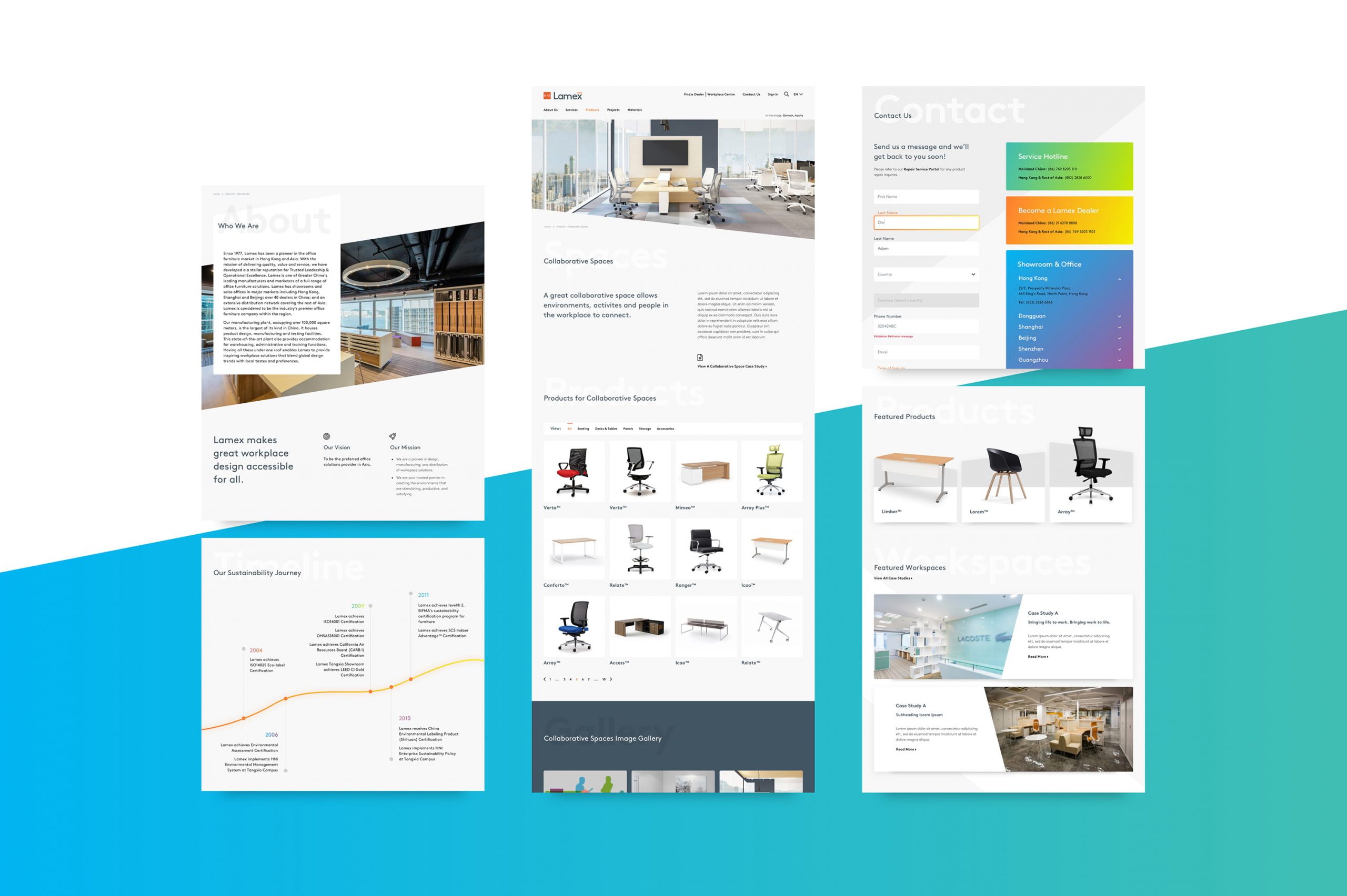
Since the Lamex website update, the site bounce rate has decreased by 20%.
Awards
Transform Awards Asia Pacific 2019
Best rebrand of a digital property
Role
Design Lead
Business Analyst
Sector
Consumer & retail,
interior design
Partner Agency
Sedgwick Richardson
Hong Kong
Other work

Asia MilesLoyalty & frequent-flyer program
HuaweiCorporate website

DidoniPersonal typeface

Suzy QProject type

AmberAviation & Aircraft Services, Start-up

LamexE-commerce

FullscriptE-commerce

Odds & endsArchived works
What can I do for you?
View me on:
© Chris Plosaj 2023