Digital doughnuts
Merging innovation with creative vision has effective results — and it helps if the product is really good too.
A palatable problem
Anyone in Ottawa, Canada will tell you that Suzy Q doughnuts are the best. However due to their extreme popularity, getting a hold of one was a frustrating experience. What started as a small food truck in 2012 quickly grew into a thriving storefront with early-morning lineups a dozen deep. So, we looked at ways to leverage technology to digitize the ordering process for people seeking some indulgent treats.

Cut the queue
Cue fellow Ottawa start-up Shopify, an e-commerce platform and retail point-of-sale system. The Shopify platform had, until then, been mostly utilized for selling hard and soft goods rather than fresh, perishable foods. But I started to think of ways we could push the platform capabilities to build an online doughnut shop that would allow the user to skip their morning line up.
Bringing the offline, online.
Good design isn’t about how technical or complicated your designs are. Often the solution to a design challenge is something that looks really simple and feels natural for the user. Good design is transparent.
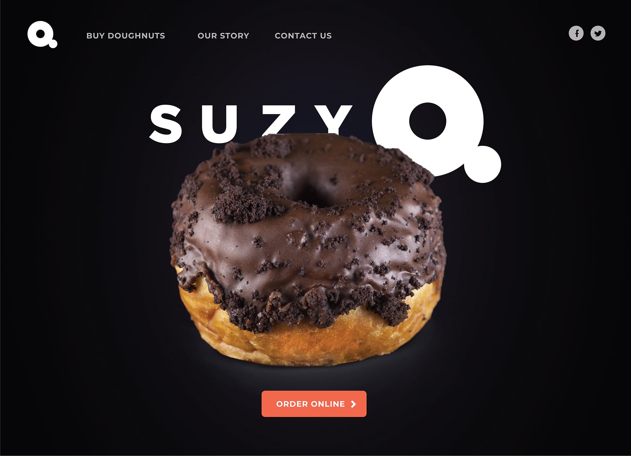
Ordering online can be an impersonal experience, and it was really important to bring as much humanity into this process as possible. Eye-catching, colorful doughnuts like “Blue Vanilla Fruit Loop” and “Mangoconut” caused in-store shoppers to gaze longingly at the tasty goods. So I suggested using a dark website background to create contrast and highlight the show stopping doughnuts. In fact, echoed throughout the entire website - even the logo - the doughnut is the brand.
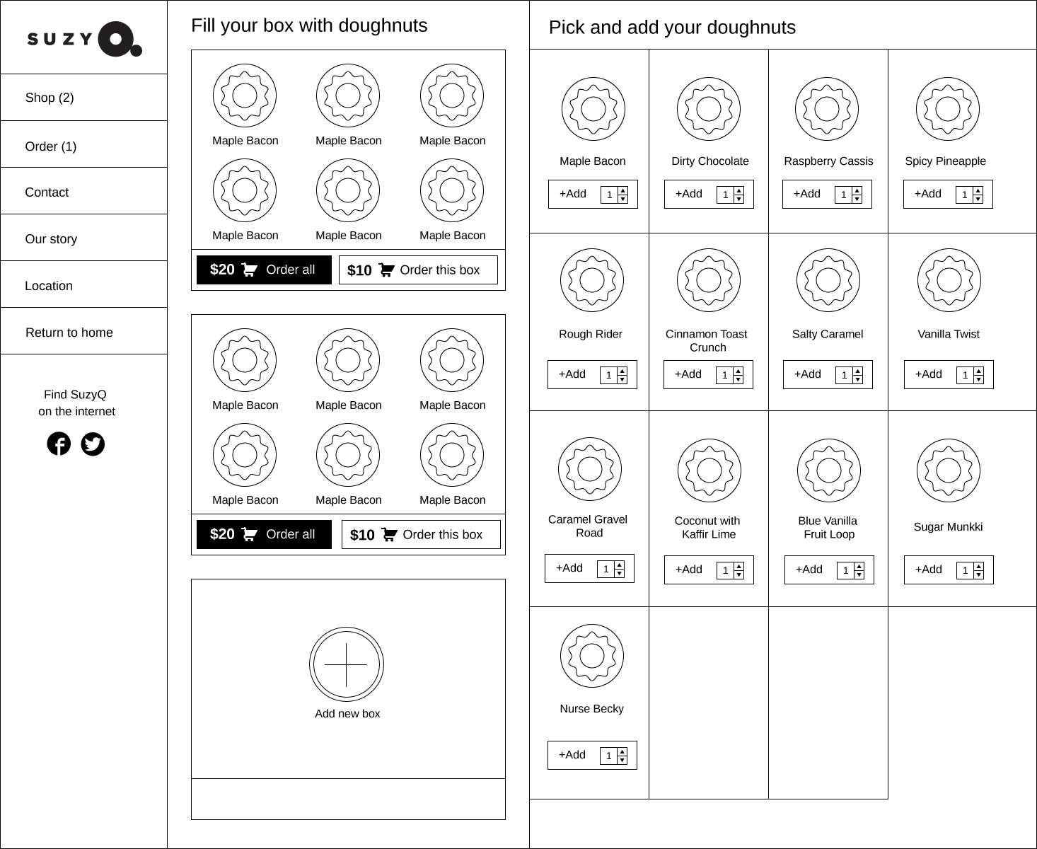
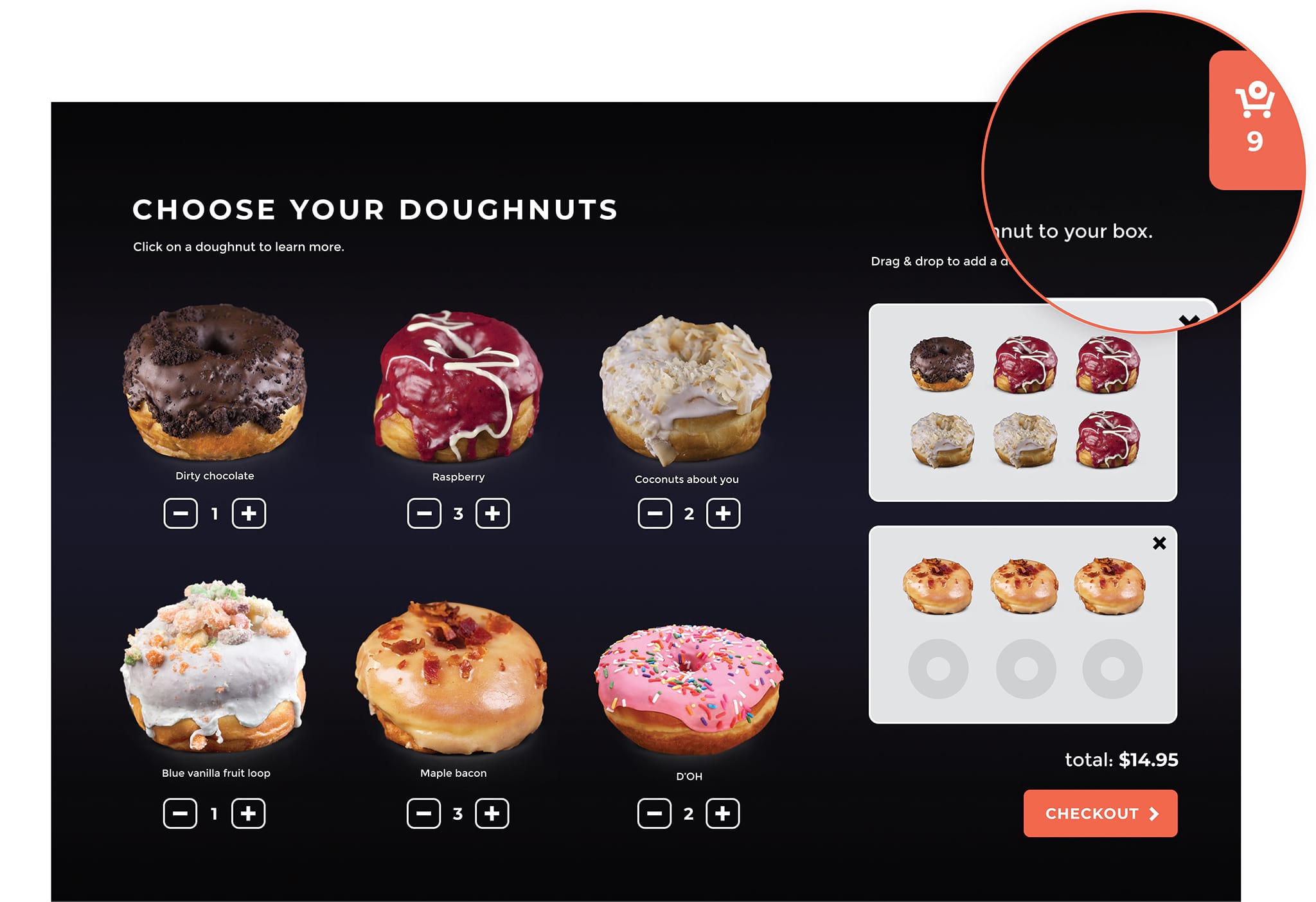
If a person were ordering in store, perhaps they wouldn’t want to mix sweet chocolate doughnuts with sour raspberry doughnuts in the same box. A drag and drop interface allows the user to tailor doughnut boxes to their own requirements.
Thinking outside the (doughnut) box
We were faced with many challenges. For example, we needed to ensure the business would be able to update the available doughnuts every day if needed.
The biggest challenge of all: Shopify’s framework only operated by allowing the user to add a product to their cart at a time. A user would add the product, and the page would reload with the item added to the cart via Shopify's backend. However, our shop required the ability to add multiple products to a cart (so the user could “assemble” their doughnut boxes) without reloading the page.
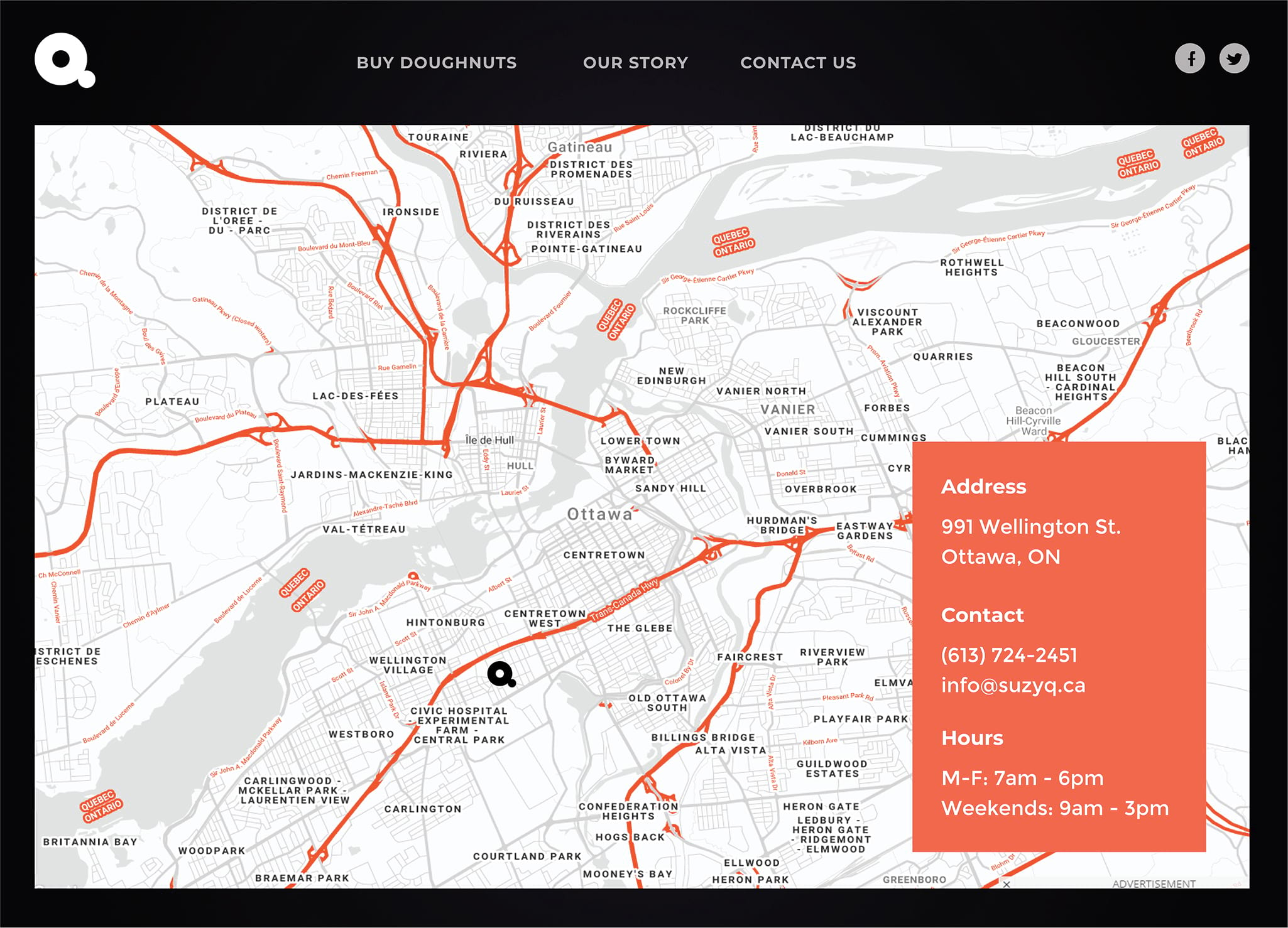
With that as a requirement, the solution was to build the online shop with a locally managed cart that was modified as the user interacted with the doughnuts. The website also integrated unique APIs such as live Google maps, customized with an on-brand look and feel:

This project was featured in Shopify Partner Spotlight and Applied Arts Magazine.
Role
Interaction Design
Art Direction
Web Development
Sector
E-commerce Foodservice
Start-up
Partner Agency
Jackpine Digital
Ottawa
Other work
Asia MilesLoyalty & frequent-flyer program
HuaweiCorporate website

DidoniPersonal typeface

Suzy QProject type

AmberAviation & Aircraft Services, Start-up

LamexE-commerce

FullscriptE-commerce

Odds & endsArchived works
What can I do for you?
View me on:
© Chris Plosaj 2023